由 CyanHall.com
创建于 2020-11-10,
上次更新:2021-04-30。
👉 如果有用请点赞。
 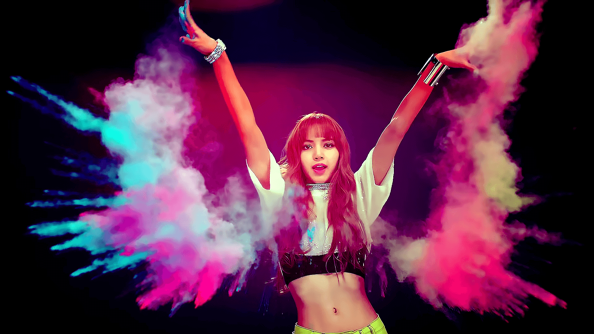 =>
=>
=>
=>
=>
=>
=>
=>
=>
=>
使用 clippy 可以轻松生成想要的
=>
首先创建一个文字,使它位于图片
=>
LISA
然后设置
LISA
=>
LISA
=>
=>
=>
可以在 bennettfeely.com 上找到更多的效果。
* 示例图片来自 LISA BLACKPINK - ddu-du ddu-du mv
👉
如果有用请点赞。 1. CSS 过滤器: 亮度
filter: brightness(0.4);
=>
2. CSS 过滤器: 灰度
filter: grayscale(1);
=>
3. CSS 过滤器: 透明度
filter: opacity(0.3);
=>
4. CSS 过滤器: 模糊
filter: blur(2px);
=>
5. CSS 过滤器: 反转
filter: invert(1);
=>
6. clip-path
使用 clippy 可以轻松生成想要的
clip-path clip-path: polygon(
50% 0%, 61% 35%,
98% 35%, 68% 57%,
79% 91%, 50% 70%,
21% 91%, 32% 57%,
2% 35%, 39% 35%
);
=>
7. mix-blend-mode
首先创建一个文字,使它位于图片
img 之上:
    <div style="position: relative">
  <img src="sample.png"/>
  <span style="
    position: absolute;
    top: 50%;left: 50%;
    transform: translate(-50%, -50%);">
    LISA
  </span>
</div>
=>
LISA
mix-blend-mode:
    .span {
  mix-blend-mode: screen;
}
LISA
LISA
8. 水墨效果
    .ink-effect {
  background-image: url(/sample.png);
  background-blend-mode: difference;
  background-position:
    calc(50% - 1px)
    calc(50% - 1px),
    calc(50% + 1px)
    calc(50% + 1px);
  filter: brightness(2) invert(1) grayscale(1);
  box-shadow: inset 0 0 0 1px black;
}
=>
9. 铅笔效果
    .pencil-effect {
  background-image: url(/sample.png), url(/sample.png);
  background-blend-mode: difference;
  background-position:
    calc(50% - 1px)
    calc(50% - 1px),
    calc(50% + 1px)
    calc(50% + 1px);
  filter: brightness(2) invert(1) grayscale(1);
  box-shadow: inset 0 0 0 1px black;
}
=>
10. 彩色铅笔效果
    .colored-pencil-effect {
  position: relative;
  background-image: url(/sample.png);
  box-shadow: inset 0 0 0 1px black;
  background-size: contain;
}
.colored-pencil-effect:before, .colored-pencil-effect:after {
  display: block;
  content: "";
  position: absolute;
  top: 0;
  left: 0;
  right: 0;
  bottom: 0;
  background-size: cover;
  box-shadow: inset 0 0 0 1px black;
}
.colored-pencil-effect:before {
  background-image: url(/sample.png), url(/sample.png);
  background-blend-mode: difference;
  background-position:
    calc(50% - 1px) calc(50% - 1px),
    calc(50% + 1px) calc(50% + 1px);
  filter: brightness(2) invert(1) grayscale(1);
}
.colored-pencil-effect:after {
  background: inherit;
  mix-blend-mode: color;
}
=>
* 示例图片来自 LISA BLACKPINK - ddu-du ddu-du mv
更多


